Minnesota Tech for Success (MTFS) is a non-profit organization that strives to create digital equity for students by partnering with schools and educational organizations to provide technology access, engaging STEM programming, and IT workforce development in underserved communities.
The client wanted a more clear understanding of what prospective students expect of the MTFS Learn section of their website.
Project goals
Understand expectations of prospective students looking to find information on programs and courses, particularly as they view the MTFS Learn section of the site
Uncover ways to give prospective students a feeling of inclusion so they don’t assume their personal barriers won’t be applicable toward participating in courses
Gauge how well the site provides users with an understanding of what means to be in the IT career field
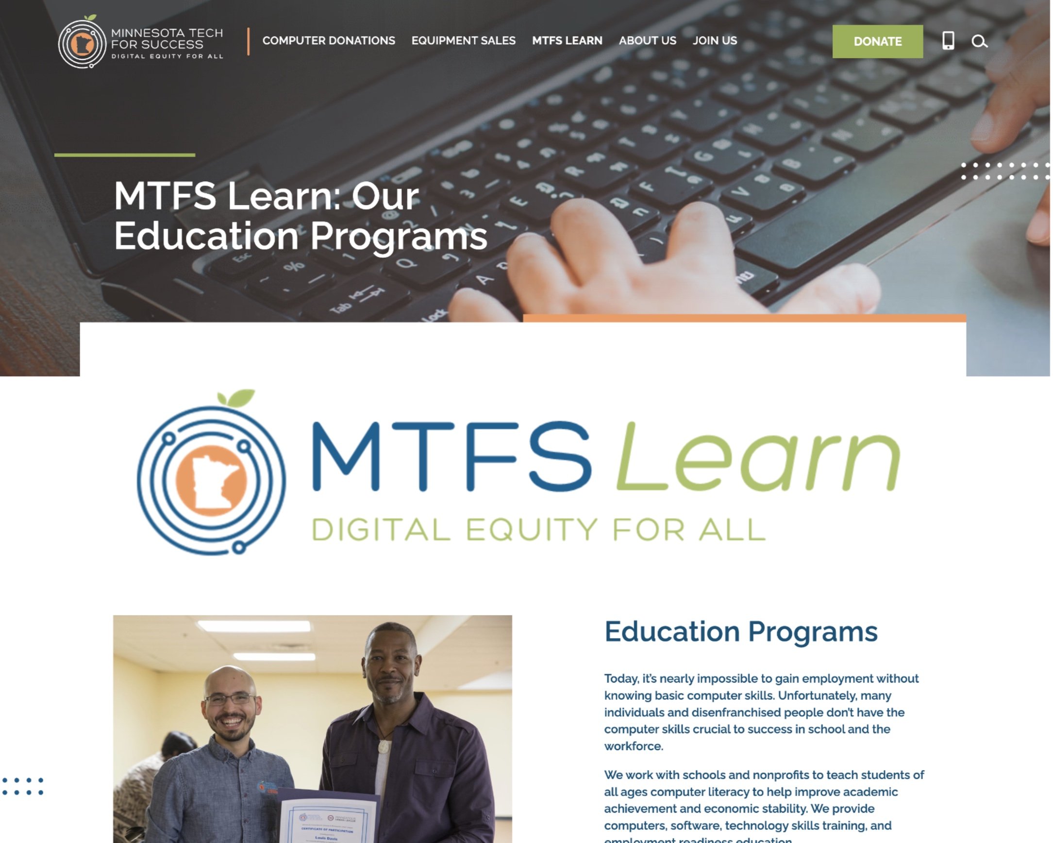
The MTFS Learn page
Research goals
Provide an easier experience for prospective users to learn about classes
Help users understand how they may be eligible for programs
Give users a better understanding of what the IT field is and life as an IT student
Heuristic analysis
Before proceeding with user testing, my team and I each performed a heuristic analysis using the Jakob Nielsen’s 10 usability heuristics. My results showed some key findings such as a lack of confirmation when submitting a form, unclear terms and language, poorly formatted links and an unexpected and irrelevant video popup during a form submission.
My individual heuristic analysis results
Moderator guide
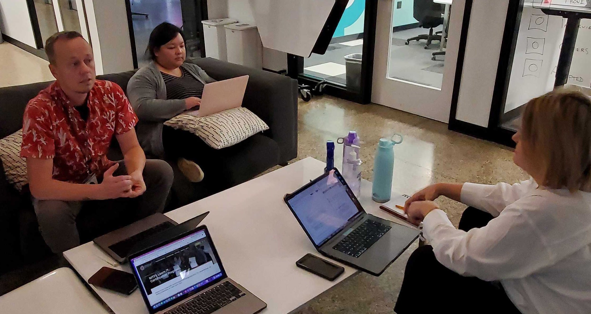
My research team and I then moved forward with writing a script to use while each test user performed 3 main tasks:
Use the website that will be presented to find information on courses and course content
Use the site to request more information
Fill out the request information form as you would in a real world situation
User testing script
STUDY PARTICIPANTS
11 total users
5 primary users*
7 secondary users
*Primary users met the following criteria:
Experienced unemployment or underemployment
Sought learning opportunities in tech to later pursue internships, employment, or further education
Experienced any barrier to employment (prejudices, stigmas, cost of entry, lack of access, etc)

After testing users, my team and I synthesized our data …

… and crafted solutions
Key findings and recommendations
Terminology and capitalization was confusing
Nearly all users ultimately found the course listings, but struggled due to a lack of comprehension of what MTFS LEARN and other program names meant in the header bar and dropdown menu.
In addition, all 11 users read the “IT” in MTFS LEARN IT as the word “it,” thus leading users to assume the program name was “Learn it.”
Recommendations:
Consider using clearer language such as “classes,” “programs” or ”courses” particularly on the homepage and header bar
Use upper and lowercase letters for program names throughout the site
Offer brief descriptions of what each program is so the user can learn connect the names to what they mean
Pop-up donor video was irrelevant
7 out of 11 users were confused by the pop-up video that played after they submitted the Request Information form. This pop-up appeared inconsistently across all testers. Many users mentioned they weren’t expecting a video but rather a confirmation at this stage.
”Oh, this is going to a video — don’t know why it would do that.”
–Test participant
A video thanking donors opened after requesting information, which confused users.
Recommendations:
Display a thank you video when a user completes a donation, not after requesting class information
If showing a video after requesting more information, have it pertain to programs, classes or student life
Confirmation of form submission wasn’t clear
7 out of 11 users were expecting a more obvious confirmation after they submitted the Request Information form and were not easily aware of next steps or how they might be contacted.
“…it was not apparent at all — seemed like just another paragraph of information.”
–Test participant
Confirmation was located in an unexpected area on the page and formatted in a way that felt unrelated to the form submission.
Recommendation
Consider having an instant, more obvious signifier (such as a pop-up window) showing confirmation and next steps immediately after user submits the form
Click below to view my findings & recommendations report as it was presented to the client
Conclusion
If given another round of testing, I would continue the research by asking users more about representation and what their understanding of the IT field is. It was a pleasure helping out a great organization like MTFS that offers such impactful services for people with barriers in life.


